Helvetica is God/Satan
Print Design + Poster Design
Date
2014
Client
IADT
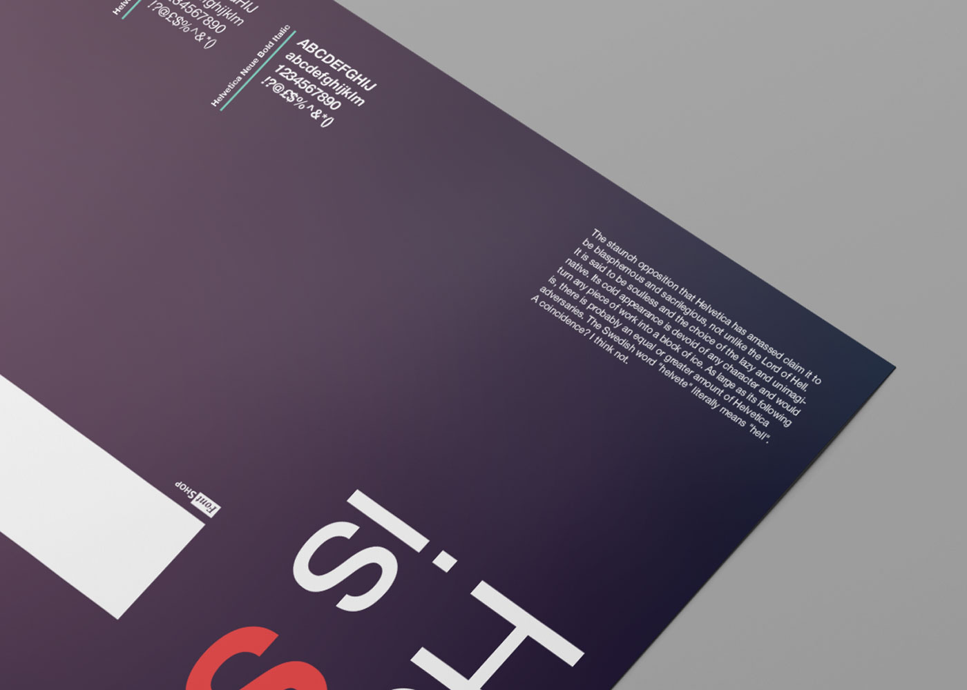
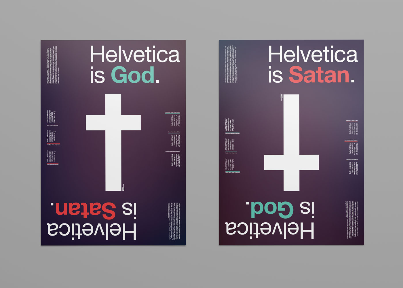
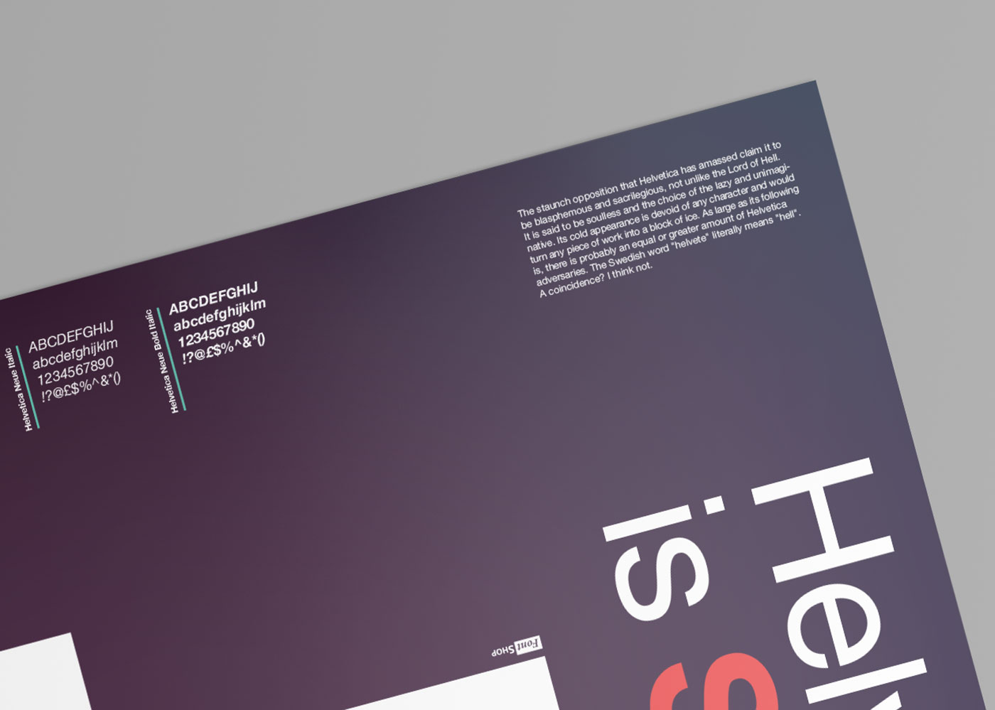
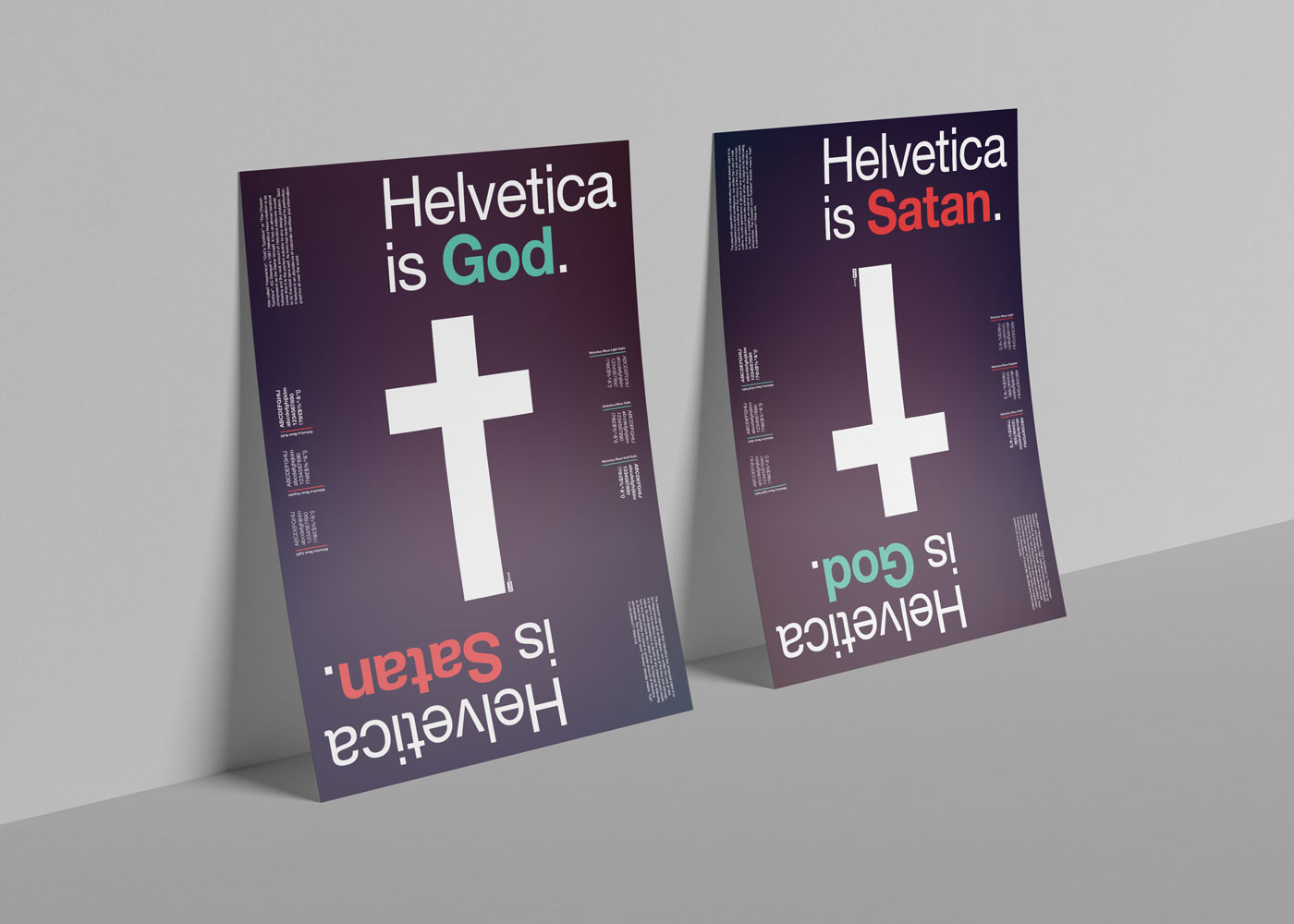
The project was designed in a response to a brief asking for a typographic poster design, featuring an assigned typeface. The target audience was meant to be designers, who upon seeing the poster would rediscover their love for one of the classic typefaces.
The typeface I got to work with was Helvetica Neue. The approach was to show how omnipresent it is and also how strongly people feel about it. Those two factors brought on the idea of placing Helvetica in a religious setting, comparing it to either God or Satan, addressing the lovers and haters respectively. The symmetrical design allows the poster to be flipped upside down, changing the message of the heading alongside the Christian cross becoming a Satanic one.


